Arria NLG Studio SaaS Product
UX/UI design for product rebrand and new features
Arria NLG Studio is a web-based NLG toolkit that helps you quickly build lightweight natural language applications. NLG Studio allows non-NLG specialists to build their own applications within hours.
NLG Studio's existing UI (formerly Articulator Lite), was very minimal with a flat colour palette. As the app grew and more features were added the UI became unintuitive. The app became very feature driven and not much emphasis was placed on the user exprience. The challenge was to improve the user interface and bring it more inline with Material Design principles and thus increasing usability.
Inspired by Material Design a fresh new colour palette was created as well as a rework of the UI to make the project types and actions clear to understand and follow.

Colour Palette
A colour palette was chosen which compliments the original NLG Studio teal.
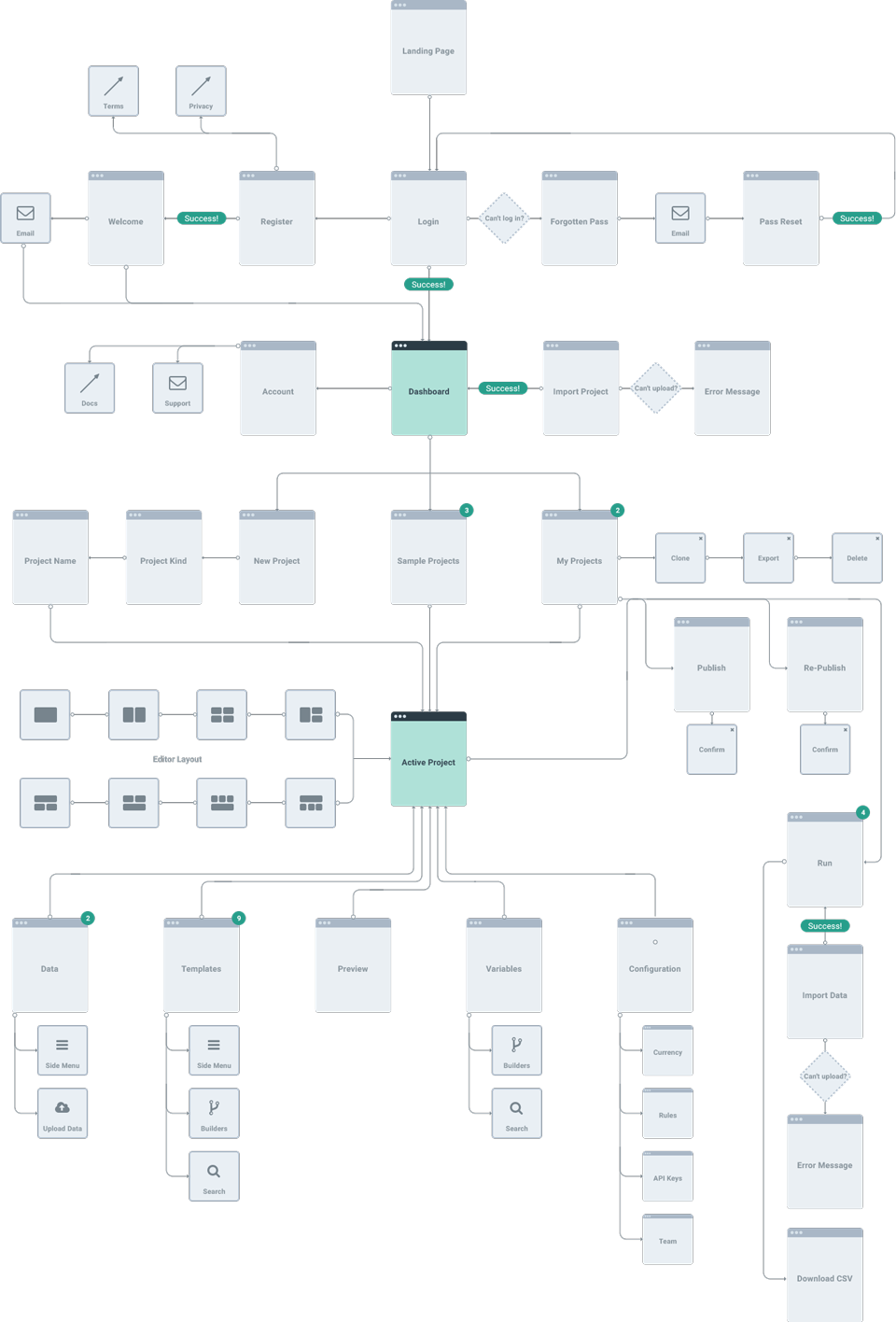
Defining the user flow
Arria NLG Studio's features had grown since it's original scope and a lot of the original thinking was no longer relevant.
A new user flow was created to map out the existing, new and any horizonal features within the app.
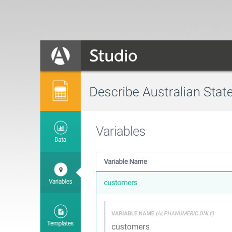
New combined side navigation and title bar
The original navigation was split into two parts, with the emphasis being on the Data and Templates sections. As the app functionality grew, the Variables section has become as important, so needed to be given the same prominence and easy access. Also, more emphasis needed to be put on which project type the current project is.
A unified side navigation was created to increase the usability and button prominence. The project type indentification was solved by carrying through the unique project type colours and icons inside the projects for easy recognition.
New UI design
Arria NLG Studio's existing UI was very minimal with a flat colour palette. As the app grew and more features were added the UI became unintuitive.
Inspired by Material Design a fresh new colour palette was created as well as a rework of the UI to make the project types and actions clearly to understand and follow.
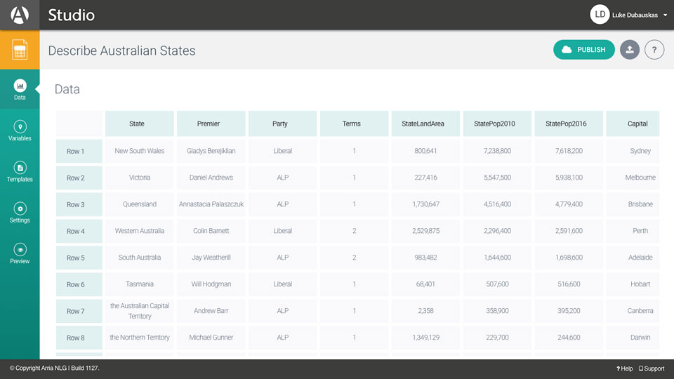
Data
This existing data table UI needed a rethink. The design didn't match the rest of the app, and a new multiple data sources feature needed to be included in the UI.
I simplified the table UI, and also how new rows and columns were added. I then moved the data list and upload new data feature to an expandable side panel for easy access.
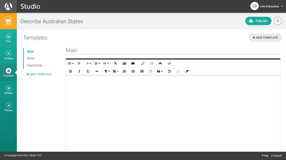
Templates
Inserting and editing functions in the template screen was complicated and time consuming. Previewing took place in a modal which meant you couldn't see what you were working on.
On selection of any element in the editor, a mini dropdown toolbar was added to give access to all the function builders, and also a quick preview panel at the bottom.
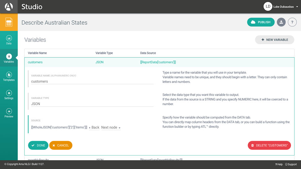
Variables
In the existing variables screen, editing took place in expanded dropdown panels. This took up a lot of real estate, and one function could only be built at a time.
Moving the editing inline, and then adding a mini dropdown toolbar to each field, meant users could access multiple function builders from within each variable.
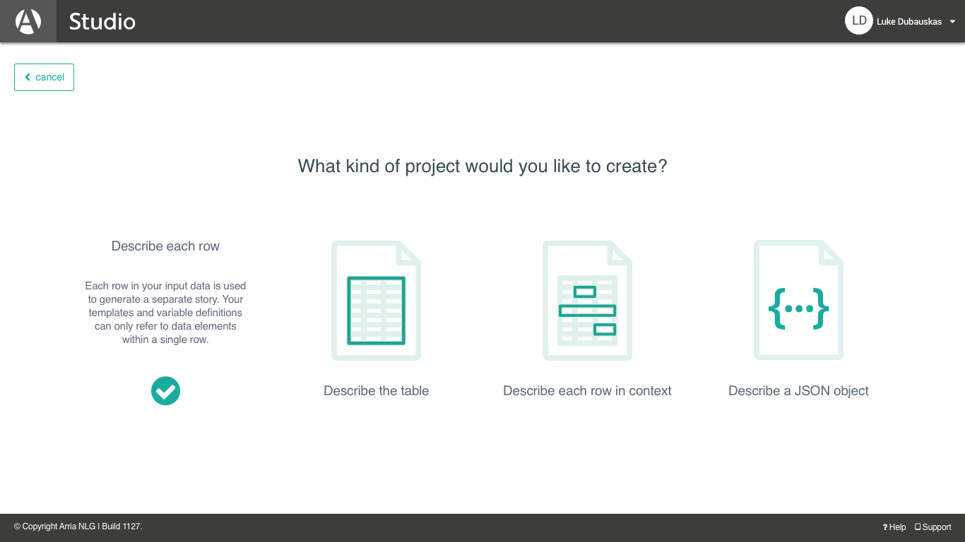
Project Type Icon Design
Arria NLG Studio features four project types that can be used to create your narrative. Each project type has a specific use case and needed to be easily to identified.
Four icons were created which clearly illustrate each project type. These icons are used as a visual reference when creating a new project, when selecting an existing project, and also within a project.
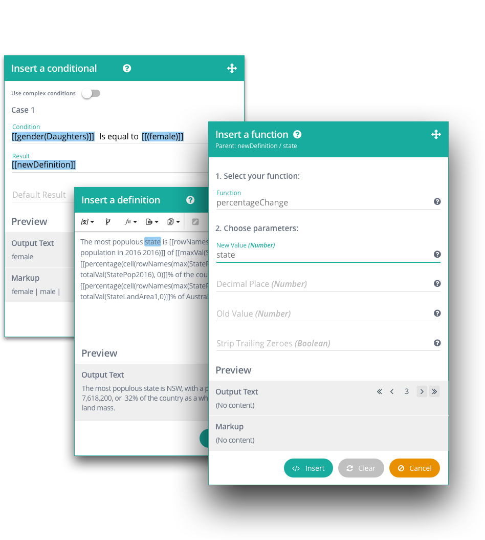
Arria NLG Studio Function Builders
The existing way to build functions in Arria NLG Studio was not very intuitive. Only one function could be built at a time, and the builders opened in Bootstrap modals which limited the users. Users had no other option but to focus on the open builder only.
Converting the standard Bootstrap modals to draggable modals without the backdrop meant that users could move the builders around to view the content on the page. In each field of the builders a mini dropdown toolbar was added so users piggyback multiple function builders together.