Yabonza Property Management App
End to End Product Design from Concept to Final UI
Yabonza, a proptech startup which launched in Sydney in 2017, is the game-changing new name in property management. After testing their business model in the UK it was time to build their platform and launch in Australia, then go global.
Design and build a web application to manage everything to do with your rental property including; listings, financials, repairs and maintenance, tenancies, property documents, and adjacent services.
As the sole designer, I was responsible for the user experience and visual design of the Yabonza web app, starting from scratch to deliver an MVP and then rolling out the final platform.
The design journey
The Yabonza platform UX and UI design journey consisted of two major phases, starting with the MVP. Having joined Yabonza during their exploration phase, I was tasked with complete design for the platform from concept to final UI.
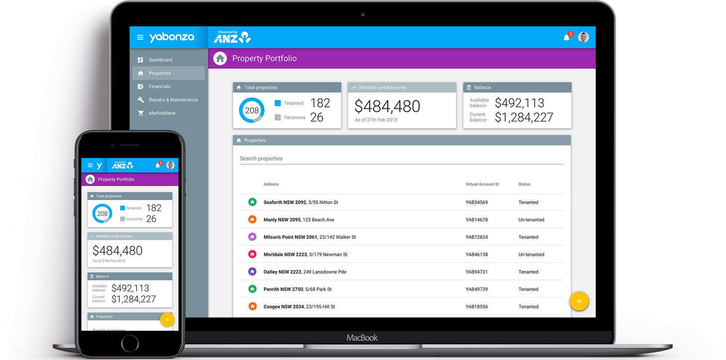
The MVP
With the front-end framework built using Angular, the clear choice was harnessing the power of Angular Material components to quickly design and build out the MVP. We were then able to validate the product idea and use this foundation as the base for adding new features.
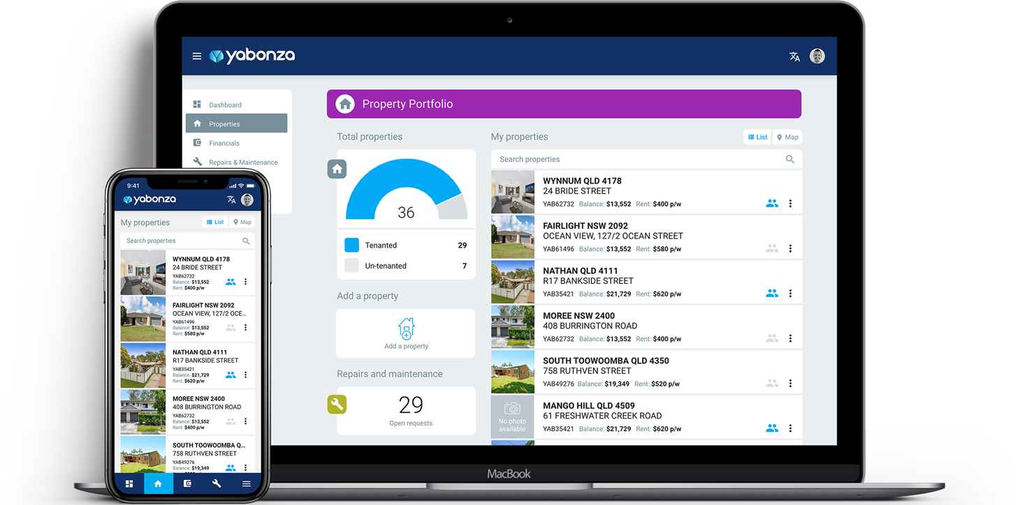
Official Release
For the official launch a refresh needed to give the app its own identity. Keeping to Material Design principles I created a new design aesthetic to match the newly created company identity and colour palette. This new UI design moved away from the standard Material Design navbar and sidebar, and gave elements more breathing room. This design refresh added a focus on data visualisation, improvements to the layout, and the inclusion of images and illustrations.
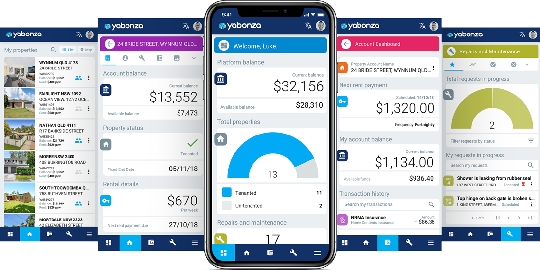
Moving Important Clicks to the Thumb Zone to improve the Mobile Experience
With the overuse of the hamburger menu UI pattern in the top navbar, along with its mobile usability issues, I wanted to look for an alternative solution for displaying important menu items on mobile. The challenge was to make the platform feel more like a native mobile app.
Utilising native app design principles with an emphasis on the thumb zone, I moved the navbar to the bottom on mobile and cut the menu items down to the 4 most important clicks. The hamburger menu was then included, which once clicked it opened the full navigation menu.
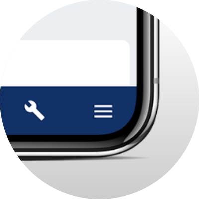
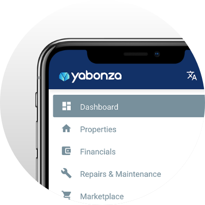
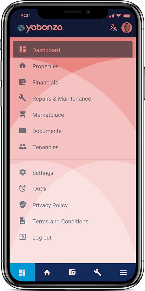
Mobile footer menu with important clicks, referencing the mobile thumb zones
The Introduction of a Secondary Menu
As new features were added to the app users needed a quick way to access additional content relating to each screen.
As there wasn’t additional content for each section or screen of the app, I created a secondary menu which appears as a dropdown card. This also serves as breadcrumbs for each top level section.
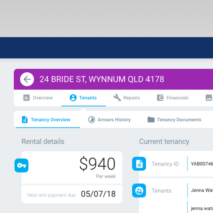
A different approach for mobile
For mobile a different approach was needed. I created a solution where the section specific navigation bar turns into a dropdown menu. This gives a clear hierarchy to the menu and sub-menu items and makes it very user friendly on mobile.
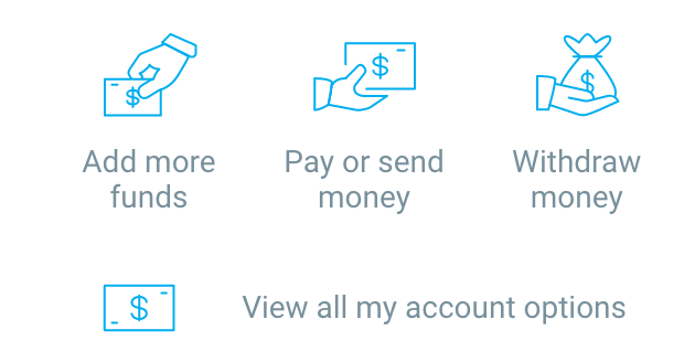
A User Friendly Way to Split Payments
Yabonza added a feature to allow the operations team to disburse all available funds for a property to its landlords. A simple, easy to use solution was required to manage the payment splits for multiple landlords.
As well as the ability to manually insert amounts, Material Design input sliders were included for each landlord. These are linked making the payment splits easier to control, and improving mobile usability.
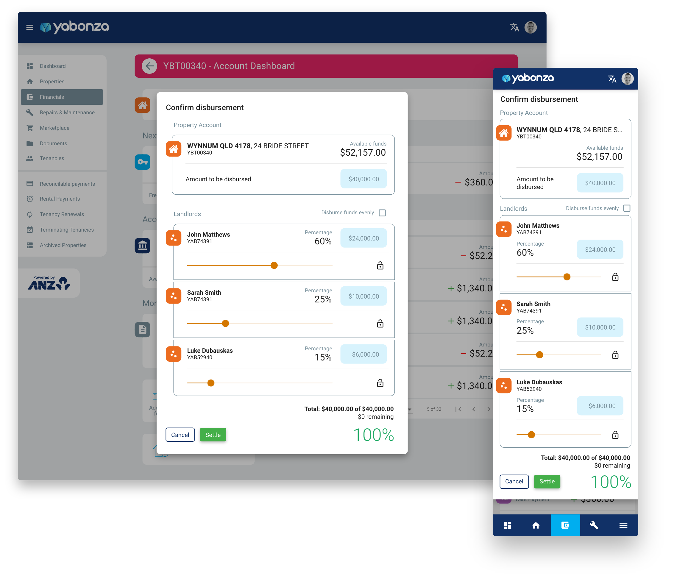
The available funds can be disbursed to the landlords associated with the property
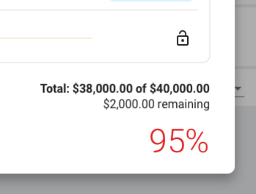
The percentage split across the landlords needs to equal 100% in order to be disbursed
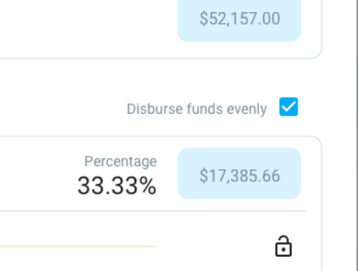
The user can manually adjust the sliders or tick disburse funds evenly to manage the splits
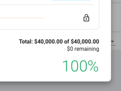
With the percentage at 100% the disbursement is ready to be submitted
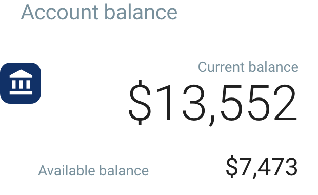
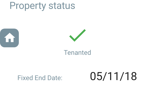
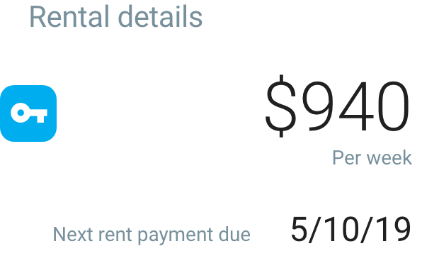
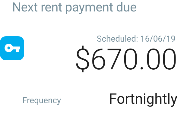
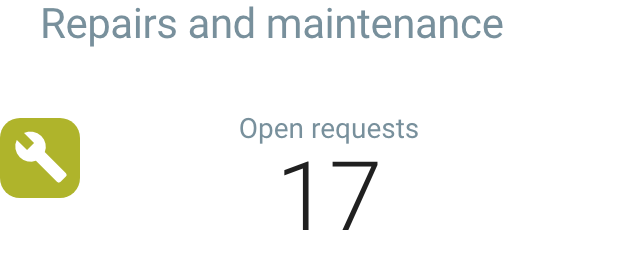
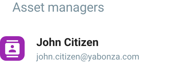
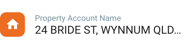
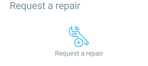
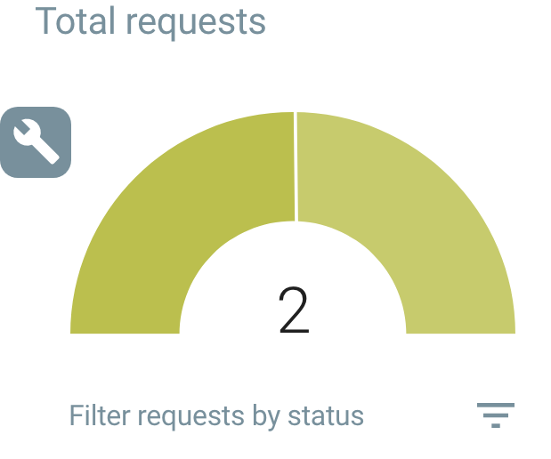
Key Insights and Action Cards
With the Yabonza app essentially being a massive dashboard, a solution was required for users to view key insights and statistics relating to the management of their rental property. Users also needed a way to get quick access to revelant actions relating to each screen of the app.
After researching the different users of the app I created reusable key insight and action cards which can sit alongside the content of each screen. Users can get a top level view of how their property asset is performing and address any issues with the use of the screen relevant action cards.

Managing repairs and maintenance in the app
The Yabonza operations team required a feature packed section of the app where they could manage all the repairs and maintenance requests for the various properties under management. As requests can be created by tenants, landlords, and even the operations team itself, it was important that the user interface be simple and intuitive, to ensure easy completion of each phase of the repair requests from start to finish.
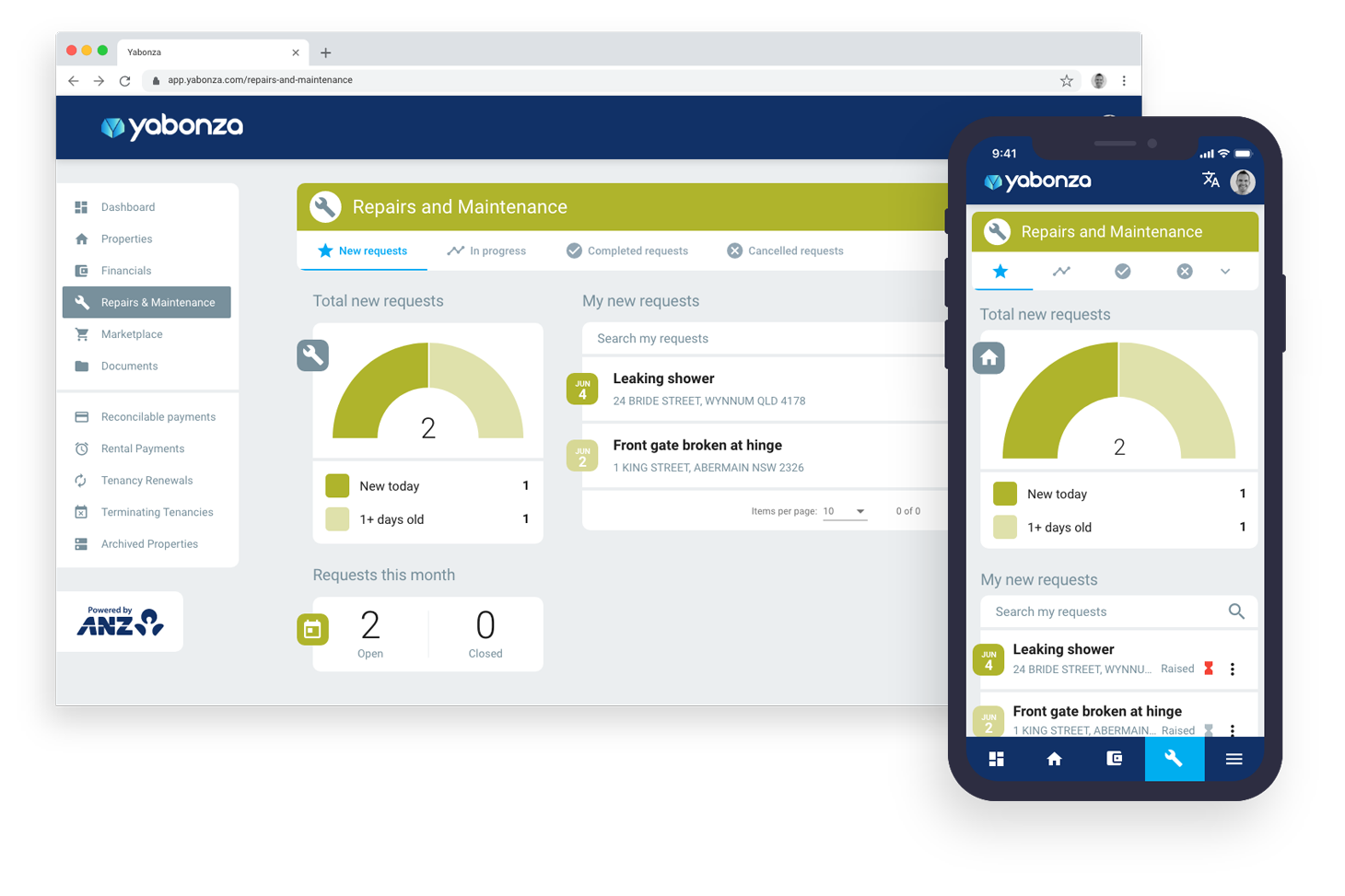
View all the repairs and maintenance requests in one place
To highlight and group the open repair requests, the Repairs & Maintenance section features various tabs to separate new, in progress, completed and cancelled requests. This screen features the New Requests tab which lists the requests by order of date created, that require approval by the operations team.
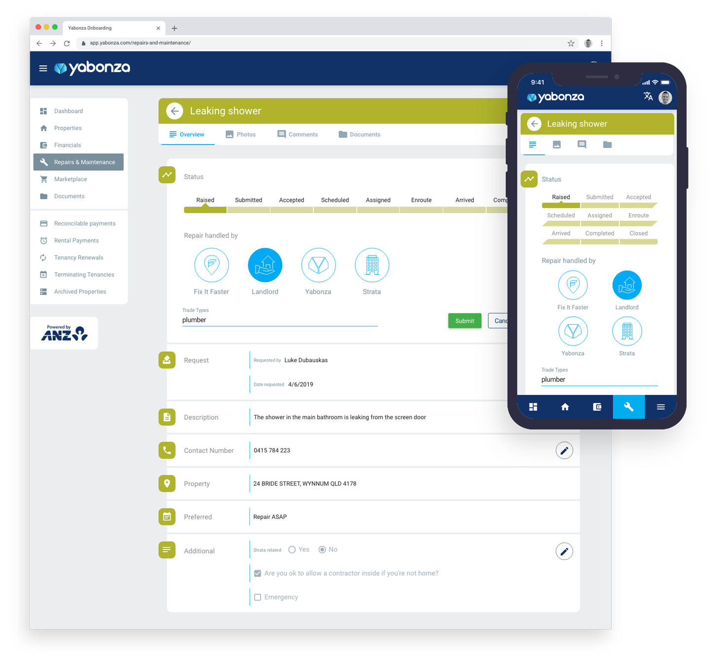
An easy way to approve and manage requests
Once a new request is created, the Yabonza operations team requires a quick way to review the request, select who will be handling the repair and which repair category type the request falls under, and then finally submit their approval.
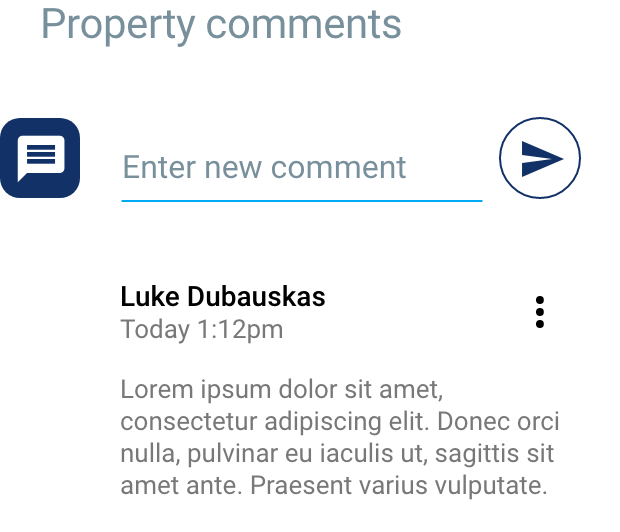
The tenant, landlord and operations team are then able to track the status of the repair via the progress stepper at the top. The overview screen shown here features all the relevant information for the request. The user can then easily navigate via the tabs to view photos, comments and documents for the current repair.
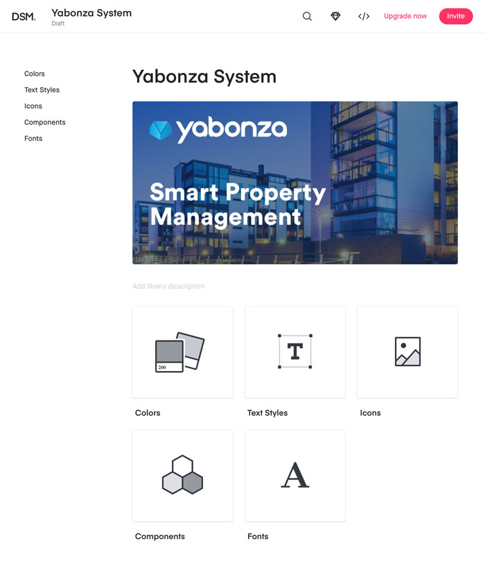
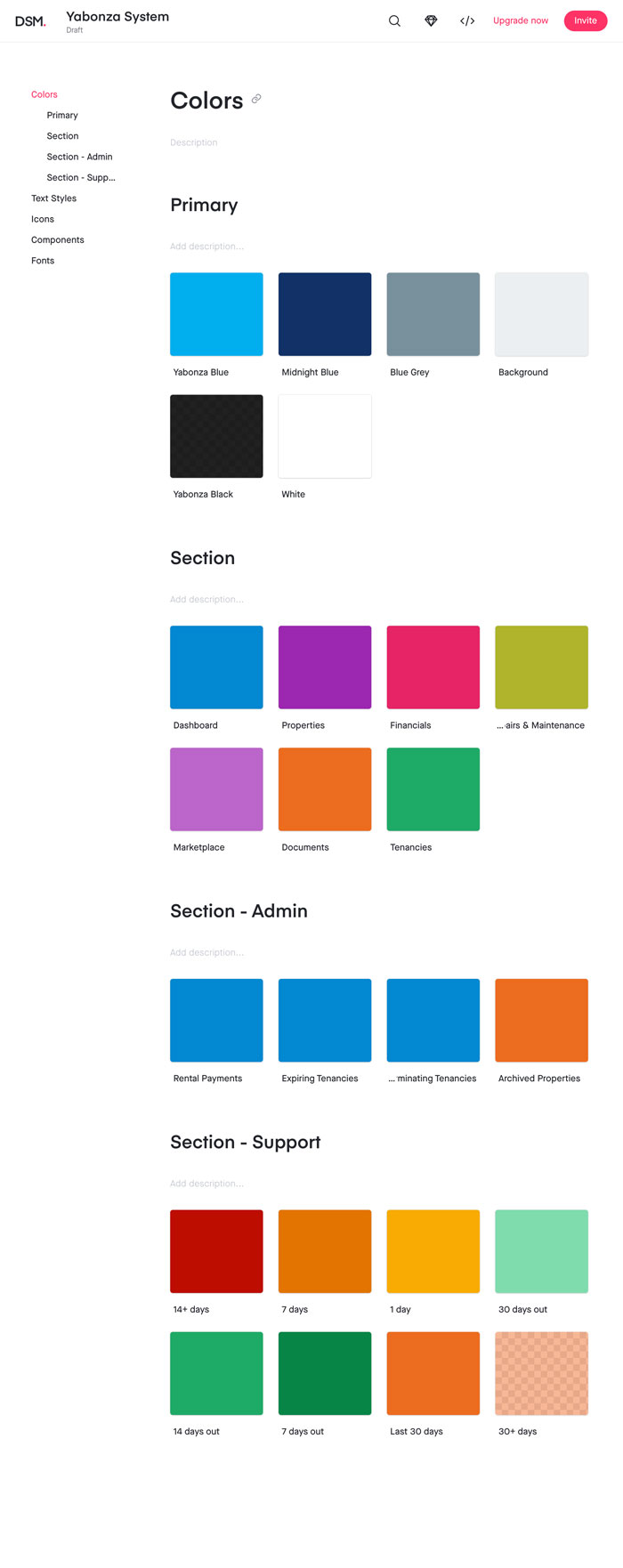
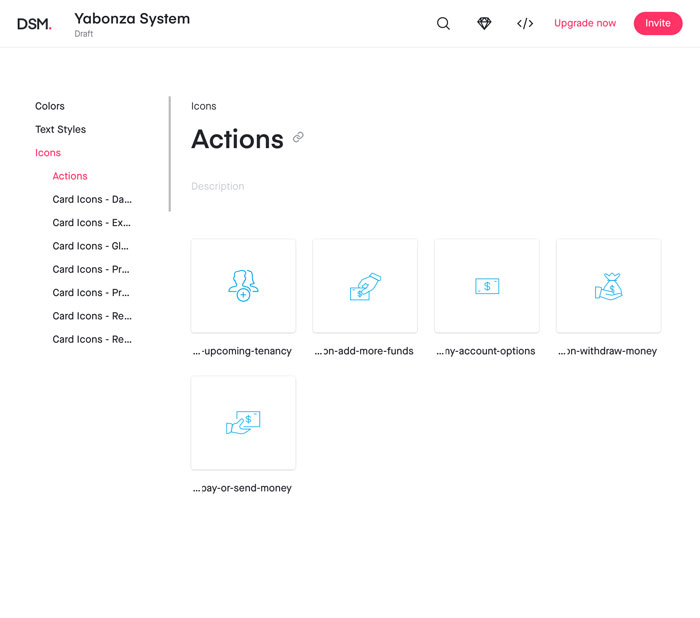
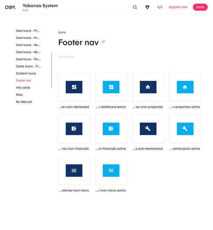
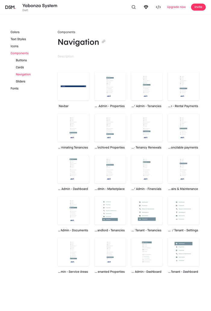
Yabonza Design System
As the UI took on its own design aesthetic and moved away from the Material Design theme, I stored and managed the components in a custom Yabonza design system using InVision DSM.